
Today, our Developer, Dom runs through why optimising your website for mobile viewing is so crucial, and how we develop a site to seamlessly integrate on desktop and mobile.
As one of the web developers at Digital Scientists, I can safely say we understand that mobile optimisation is essential for both effective web design and SEO performance. With mobile devices accounting for 58.2% of all internet usage, optimising your website for phones and tablets is no longer optional - it’s a necessity. A mobile-friendly site ensures that users have a smooth and seamless experience, making your website stand out from the competition as well as assist in indexing you higher than the competition.
Why Mobile Optimisation Matters
Failing to optimise for mobile devices puts your website at risk of losing a significant portion of your audience and negatively impacting your business. With mobile-first indexing, search engines prioritise mobile-friendly sites, meaning poor optimisation can hurt rankings, visibility, and traffic on search engines. A seamless mobile experience reduces bounce rates, improves dwell time, and boosts engagement, key user signals that positively impact SEO performance. Optimised sites also enhance conversions by making navigation, reading, and actions effortless on smaller screens. This creates a positive feedback loop: better rankings lead to more traffic, which drives better user signals and further growth. So, if your site isn’t optimised for mobile and doesn’t provide a seamless experience, don’t settle for less. Reach out to a trusted website design firm, or better yet, get in touch with us for expert assistance.
Our Process for Mobile Optimisation
The first step is analysing how your website currently performs on mobile devices. This involves identifying misaligned elements, poor styling, or features that don’t translate well to smaller screens. Tools like Zoho Sites and WordPress preview screens can help us visualise these issues. Another vital tool that can help in this step is Google Chrome’s developer tools. This set of advanced website tools enables developers to analyse the performance, behaviour, and optimise their site with precision. It allows businesses to access and edit their HTML and CSS code locally, providing a practical way to test and resolve formatting issues. Additionally, these tools feature a built-in device toolbar that simulates mobile views, making it significantly easier to inspect and refine mobile responsiveness.
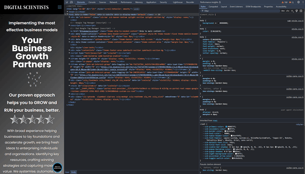

After pinpointing the problem areas, we begin optimising using CSS media queries a powerful tool for customising styles based on screen size.
Text often appears too large or skewed on mobile. Using media queries, we define specific font sizes and line spacing for smaller screens. For example:
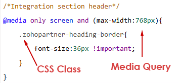
Pay close attention to how your stylesheet is organised. When a class is applied to multiple elements, the styles from the class declared last in the sheet will take precedence. To override this, use the !important suffix. This forces the rule it’s applied to the top of the CSS hierarchy, ensuring it takes priority over any conflicting styles.
Spacing Adjustments: Desktop layouts often have well-balanced spacing, but on mobile, elements can become cramped. To address this, we use margins (space outside an element) and padding (space inside an element). For example:

Builders like Zoho Sites offer features such as row spacing, allowing you to define the spacing and layout of rows, including the number of columns. Empty columns can serve as spacers, creating evenly distributed gaps between elements for a clean and balanced design.
We thoroughly test every change to ensure it enhances the user experience across all devices, maintaining your site’s visual appeal and functionality on any screen size. By utilising tools like live previews and Chrome DevTools, we meticulously inspect and refine every detail, ensuring everything is flawless before publishing the updates.
Mobile optimisation is not just about addressing issues it’s about crafting a seamless, cohesive experience for your audience while improving your site’s index score. Our expert team ensures your website is fully optimised, enabling you to engage users more effectively and convert visitors into loyal customers across all devices, resulting in a performance boost that elevates your site’s overall success.
What’s more, with the importance of mobile first indexing, the performance of your website on mobile devices can have an impact on both your sites indexing and subsequent ranking compared to your competitor’s site especially when all things are equal. The site that performs best for the user in these instances would outrank the poorer performing site.
Are you ready to elevate and optimise? Then get in touch with us today or visit our Pixel Perfect web development page.


